GoToFlow AI social media content generator logo
GoToFlow
HomeBlogBest LinkedIn Carousel Examples to Inspire Your Next Post

Best LinkedIn Carousel Examples to Inspire Your Next Post

Discover the best LinkedIn carousel examples to inspire your next post. Learn the core principles behind high-converting carousels and how to build them.

ExamplesReviewed: June 2026

LAST REVIEWED

Reviewed: June 2026 — this guide is kept up to date for current AI content workflow practices.

What you need to know

  • The best LinkedIn carousels hook the reader with a bold claim, strong statistics, or a relatable problem on the very first slide.
  • High-converting structures include Step-by-Step guides, Myth Busters, Before/After transformations, and Curated Listicles.
  • Design should be minimal: use large fonts, keep text under 25 words per slide, and ensure high contrast for mobile readability.
  • Always export your carousel as a PDF before uploading to LinkedIn to activate the native document viewer.

If you want to stop the scroll on LinkedIn, a well-designed carousel is your best bet. But staring at a blank slide isn't going to get you anywhere. You need inspiration.

In this post, we break down the best LinkedIn carousel examples and explain why they work. You'll learn how to structure your hook, design your slides, and craft a compelling call to action.

Quick Answer

A great LinkedIn carousel has:

1A strong hook: A bold claim, a relatable problem, or a surprising statistic on slide one.
2Scan-friendly structure: Short sentences, bullet points, and plenty of negative space.
3Visual hierarchy: Consistent fonts, branded colors, and clear section dividers.
4A clear CTA: Telling the reader exactly what to do next (comment, follow, or click a link).

Why You Need a LinkedIn Carousel Swipe File

Every great creator has a swipe file—a collection of examples they can reference when they need inspiration. Having a library of successful carousels helps you understand what resonates with your audience and allows you to reverse-engineer their success.

5 Real-World Carousel Examples

Example 1: The "Step-by-Step System"

This format is perfect for breaking down a complex process into easily digestible steps. Each slide introduces a new concept or action item.

Hook: "My exact 5-step system to achieve [Result]"
Slide Logic: Break down the big goal into 5 individual phases, dedicating one slide per phase.
Why it works: It’s highly actionable and encourages users to save the post for later reference.
CTA Idea: "Save this post to reference during your next project."

Example 2: The "Before and After" Tear-down

Showcasing a transformation is a powerful way to demonstrate value. Start with the problem and use the subsequent slides to reveal the solution.

Hook: "How we took [Client] from [Problem] to [Result] in 30 days"
Slide Logic: Start with the chaotic "before" state, introduce the strategy, and end with the clean "after" metrics.
Why it works: It builds authority and provides immediate proof of concept.
CTA Idea: "Want similar results? Click the link in my bio to book a call."

Example 3: The "Listicle" Breakdown

Similar to this article, a listicle carousel curates top tools, tips, or examples.

Hook: "5 Chrome extensions that save me 10 hours a week"
Slide Logic: Name the tool, show a quick screenshot or icon, and give a 1-sentence reason why it's useful.
Why it works: It sets clear expectations. If the title says "5 Tools," the reader knows exactly what they are getting.
CTA Idea: "What is your favorite extension? Let me know in the comments."

Example 4: The "Myth Buster"

Perfect for establishing authority in your niche by tearing down widely held beliefs.

Hook: "Stop believing this lie about [Topic]"
Slide Logic: State the myth clearly, then spend the next 3 slides breaking down exactly why it's false using data or logic.
Why it works: It sparks debate and positions you as a thought leader who knows better than the crowd.
CTA Idea: "Do you agree? Let's debate in the comments."

Example 5: The "Mistake Breakdown"

Fear of making a mistake is a powerful psychological trigger. This format works exceptionally well for coaches and consultants.

Hook: "3 silent mistakes destroying your [Goal]"
Slide Logic: Introduce the mistake, explain why people make it, and provide the immediate fix.
Why it works: It challenges the reader's current process and forces them to evaluate their own work.
CTA Idea: "Which of these mistakes are you guilty of?"

Turn Inspiration into Execution with AI

Finding great linkedin carousel examples is only half the battle. You still have to write the content, format the slides, and export the PDF.

Instead of spending hours in Canva, you can create a LinkedIn carousel with GoToFlow and generate the entire structure from one topic or text.

GoToFlow screen for creating a carousel from a text topic

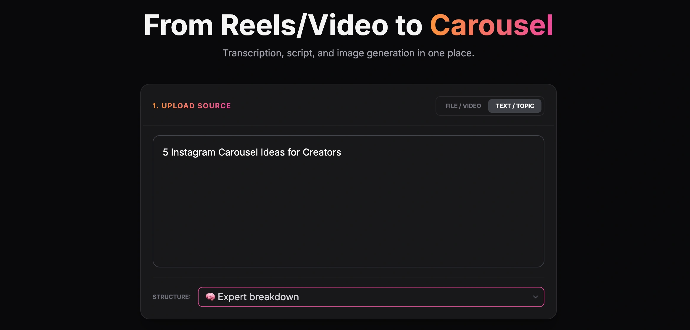
Creating a carousel from a text topic

By inputting your core topic or pasting a link to an existing article, GoToFlow can automatically structure your hook, body slides, and CTA.

GoToFlow carousel editor showing a finished Instagram carousel result

Finished carousel result inside the GoToFlow editor

Best Practices for Designing Your Own Carousels

Even if you use an AI generator, keeping these design principles in mind will elevate your content:

Keep the text minimal: LinkedIn is a mobile-first platform. Small text will be ignored.
Use high-contrast colors: Ensure your text stands out against the background.
Include a progress bar: Let readers know how many slides are left. It encourages them to swipe to the end.

Put the examples into practice

Use the patterns above as a swipe file, then turn your own topic into a LinkedIn carousel in GoToFlow so you can review the slide order, adjust the wording, and export the final PDF.

Explore more

Related tools and guides

FAQ

Frequently asked questions

What is the ideal length for a LinkedIn carousel?

Most successful carousels range from 5 to 12 slides. Anything longer risks losing the reader's attention.

What format should I use for LinkedIn carousels?

Always export your carousel as a PDF. LinkedIn's native document viewer provides the best experience for swiping through slides.

Should I include a call to action on every slide?

No, that can come off as spammy. Keep the CTA strictly on the final slide to guide users on what to do next.

Are plain text carousels better than highly designed ones?

Often, yes. Heavy graphics can distract from the message. Plain backgrounds with bold, readable text typically perform best.

How much text should be on a single slide?

Keep it under 25 words per slide. If it looks like a paragraph from a book, people will scroll past it.

Ready to Create Your Own?

Turn your inspiration into a ready carousel you can review, adjust, and export right now.

Create a Carousel
Check LinkedIn carousel hooks →

We use necessary cookies to make GoToFlow work and may use optional cookies to improve the product and understand website usage. Your choice will be saved for future cookie settings. Privacy Policy