Using the correct Instagram post size is critical for engagement. If your image is too small, it will look pixelated. If the aspect ratio is wrong, the algorithm might crop out crucial parts of your photo or text. Whether you are posting a single image or a multi-slide carousel, understanding exact dimensions ensures your content looks professional.
What you need to know
Don't waste time formatting slides
>
The 3 Main Instagram Post Sizes
Instagram supports three primary image orientations for the feed. Here is the exact breakdown of dimensions and aspect ratios.
1. Portrait (Vertical) Size
Portrait is the undisputed king of Instagram feed posts. Because most users browse the app on vertical smartphone screens, a 4:5 image takes up nearly the entire screen. This forces the user to pause their scroll, blocking out distractions from the post above or below yours. It is highly recommended for infographics, text-heavy posts, and carousels.
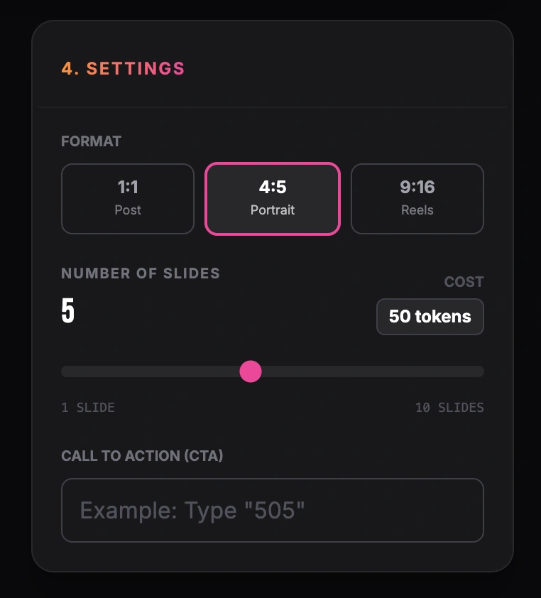
Setting format, number of slides and call to action
2. Square Size
The square format is Instagram’s original layout. While it doesn't take up as much vertical space as a portrait post, it remains a reliable and clean format. Square posts are particularly easy to manage because they look identical in the feed and on your profile grid (which displays all posts as 1:1 squares).
3. Landscape (Horizontal) Size
Landscape images are the most difficult to execute well on Instagram. They take up very little vertical space, meaning users can easily scroll past them. This format is typically reserved for uncropped photography or wide panoramic shots where the full width is necessary to tell the story.
Looking for content inspiration? Check out our Social Media Post Ideas guide.
Instagram Carousel Best Practices
When dealing with carousels, size consistency is your biggest hurdle.
Lock in the first slide
Instagram will force every slide in your carousel to match the aspect ratio of the first slide you select. If your cover slide is a square (1:1), all portrait (4:5) images behind it will be awkwardly cropped.
Use portrait for text
If your carousel contains educational text or lists, always use the 1080x1350 portrait size. The extra vertical space allows you to use larger, more readable fonts.
Design for the swipe
Since carousels are interactive, consider adding visual cues (like an arrow or a continuous graphic that spans across the edge of the slide) to encourage the user to swipe to the next image.
Common Formatting Mistakes
Uploading low-resolution files
If you upload an image smaller than 320 pixels wide, Instagram will stretch it, making it blurry. Always export your designs at 1080 pixels wide.
Putting text in the "danger zones"
When a portrait (4:5) image is viewed on your profile grid, it is cropped to a 1:1 square. If you put important text at the very top or bottom of your 4:5 design, it will be cut off when users view your overall profile grid.
Formatting and resizing images manually for every social network can be a tedious process. While a normal text post is just text, a multi-slide post requires strict adherence to design rules. If you regularly share expertise, lists, or step-by-step guides, an automated tool like GoToFlow can transform your raw text into a finished carousel with the perfect Instagram dimensions applied automatically.